Ad unit template with a native banner
Note
We recommend using a preset ad unit template if you don't have any experience with HTML and CSS. In the format settings, select the appropriate template in the Design template field and specify the grid size. After that, click Edit code and add the CSS styles used on your site.
The template determines which ad elements will be displayed in the ad. All available elements are shown in the schematic below:
Each element displayed in the ad corresponds to its own HTML tag. Here is a simple template that uses the main elements:
<div class="wrapper">
  <div class="headline">Read also</div>
  <ya-units-grid cols="${grid_columns}" rows="${grid_rows}">
    <div class="image"><ya-unit-image /></div>
    <div class="title"><ya-unit-title /></div>
    <div class="desc"><ya-unit-desc /></div>
    <div class="domain"><ya-unit-domain /></div>
    <div class="meta">
      <span class="category"><ya-unit-category /></span>
    </div>
  <ya-unit-kebab />
  </ya-units-grid>
</div>
You can use this to:
-
Change the ad unit's appearance from a grid (
<ya-units-grid />) to a slider (<ya-units-slider />). -
Add your own layout to the template.
-
Swap elements or nest elements into other HTML tags.
-
Remove additional elements you don't want displayed in the unit. For example, if you wish to hide a label, delete the line
<ya-unit-desc />.
Warning
The template must include the following elements: <ya-units-grid /> or <ya-units-slider />. You cannot delete these elements because they are required for the ad unit to work properly. All elements that follow the <ya-unit-... /> format must be placed inside <ya-units-grid /> or <ya-units-slider />.
Please be sure to follow the requirements laid out for the mandatory ad elements so that your ad complies with the Rules of participation in Yandex Advertising Network and advertising law. Please keep in mind that ads for mobile apps and other ad types have different sets of required elements.
Required ad elements
As defined by the terms of the Yandex Advertising Network, these elements must always be in the ad unit:
|
Element |
HTML tag |
Required ad element |
Required mobile app ad element |
|
The “Ad” label and the age restriction label. |
|
Yes |
Yes |
|
Menu icon |
|
Yes |
Yes |
|
Ad title |
|
Yes |
No |
|
Domain |
|
Yes |
No |
|
Price |
|
No |
Yes |
|
App name |
|
No |
Yes |
|
App icon |
|
No |
Yes |
Note
If the ad has an age label and a warning, they are automatically added when the unit is rendered.
You can learn more about the rules of using required ad elements in Rules for managing required ad elements.
CSS class styles
CSS classes have multiple formatting styles:
grid-row: Grid row.grid-item: Grid cell.grid: Grid.ya-units-slider: Overall slider appearance.ya-slider-item: Card inside the slider.unit-wrapper: Placement.unit-image: Image or video used in the ad.
You can also create your own CSS classes and customize their styles.
Ad unit design
Note
If a unit with a native banner contains several ads, they should have the same appearance.
Unit format
Units with a native banner may have the appearance of a grid of a specific size or of a slider (a horizontal scrollable ad feed). The grid is rendered by <ya-units-grid /> while the slider is rendered by <ya-units-slider />. You can't use both of these elements within the same template.
Setting up the grid
The <ya-units-grid> element is used to draw the grid based on parameters specified in the Grid size fields. You can only change the grid size using these fields.
Exception: if you need to display a different grids for different screen sizes, specify the corresponding values in the sizes. parameter. The ${grid_columns}x${grid_rows} valuables must be listed last. For example:
HTML
<ya-units-grid sizes="(max-width: 1024px) 2x2, (max-width: 600px) 2x1, ${grid_rows}x${grid_columns}">
Here is how grids are going to be matched to different screen sizes in this example:
-
A 2 × 1 grid will be displayed on screens less than 600 pixels wide.
-
A 2 × 2 grid will be displayed on screens between 601 and 1024 pixels wide.
-
Screens wider than 1025 pixels will display a grid based on the values set in the Grid size fields on the General tab.
The grid layout is configured via CSS classes grid, grid-row, and grid-item. For example:
CSS
.grid-row {
  margin-top: 10px; /* vertical distance between cells — 10 pixels */
}
.grid-item {
  margin-left: 20px; /* horizontal distance between cells — 20 pixels */
}
.grid {
  border: 1px solid #000; /* border around the grid: thickness — 1 pixel, border type — solid, color — black */
}
Warning
Keep in mind that you should set the number of displayed ad unit cells in the HTML code. To specify the number of ads to load, change the values in the Grid size fields. For example, if you set the Grid size to 5 × 2 while the <ya-units-grid> element is configured to display a 2 × 2 grid for this screen size instead, then only 4 out of 10 loaded ads will be displayed. The opposite is also possible: if you have a 5 × 2 grid while the number of ads is set to 2 × 2, then the unit will display six empty cells.
Setting up the slider
To render an ad unit as a slider, use the <ya-units-slider /> element.
Example of a slider template:
<div class="block">
  <div class="headline">See also</div>
  <ya-units-slider>
    <div class="unit">
      <ya-unit-kebab />
      <div class="image">
        <ya-unit-image ratio="0.5" />
      </div>
      <div class="body">
        <div class="title">
          <ya-unit-title />
        </div>
        <div class="meta">
          <span class="category">
            <ya-unit-category />
          </span>
          <span class="date">
            <ya-unit-date />
          </span>
        </div>
      </div>
    </div>
  </ya-units-slider>
  <div class="block-label">
    <div class="label">Yandex recommendations</div>
  </div>
</div>
The slider design can be customized in CSS using the classes ya-units-slider (overall slider appearance) and ya-slider-item (a specific card within the slider):
.ya-units-slider {
  width: 95vw;
}
.ya-slider-item:not(:first-child) {
  margin-left: 1em;
}
You can add an ad scroll button to your slider. To do this, find the <ya-units-slider> element and add the <ya-slider-button> element inside it. The scroll direction is indicated with the direction attribute:
-
The
leftvalue sets scrolling to the left. The scroll button will be placed before the ads in the slider. -
The
rightvalue determines scrolling to the right. The scroll button will be placed after the ads in the slider.
If <ya-slider-button> includes an element with the ya-clickable class, then scrolling will be triggered once the element is clicked. If there is no such element, scrolling is performed by clicking the button itself.
For example:
<ya-slider-button direction="left">To the beginning</ya-slider-button>
When you scroll to the leftmost or rightmost position, the <ya-units-slider /> element receives the ya-slider-leftmost and ya-slider-rightmost classes, respectively.
Note
If the scroll buttons are located above the slider cell, we don't recommend hiding them using these classes: this can lead to invalid clicks.
Block appearance
To customize the unit's overall appearance (such as the text background color or margins), you need to wrap all of the ad unit's code in tags, set the class (for example, wrapper) and set up parameters for that class in CSS.
HTML
<div class="wrapper">
  <ya-units-grid cols="${grid_columns}" rows="${grid_rows}">
    ...
  </ya-units-grid>
</div>
CSS
.wrapper {
  background: #fff; /* background color — white */
  padding: 10px; /* margins inside the border, all sides — 10 pixels */
  margin: 5px; /* margins outside the border, all sides — 5 pixels */
  border: 2px solid #000; /* border: thickness — 1 pixel, border type — solid, color — black */
  border-radius: 6px; /* round the border's corners after 6 pixels */
}
Restricting the number of rows displayed
If you want to limit the number of rows displayed in the element, wrap the element you need in the <ya-clamp> tag.
Alert
Do not limit the number of lines displayed in the title: it must be displayed in full according to advertising law.
HTML
The initial design for the "Ad offer description" element:
<div class="desc"><ya-unit-desc /></div>
For the offer description, limit the number of displayed rows to two:
<ya-clamp lines="2" class="desc"><ya-unit-desc /></ya-clamp>
Or
<div class="desc"><ya-clamp lines="2"><ya-unit-desc /></ya-clamp></div>
Text format
You can use CSS to format your text. Choose the class of the element you wish to configure and change its values.
Setting up the font and spacing
CSS
.headline {
  font-family: Helvetica, sans-serif; /* font */
  font-size: 18px; /* font size — 18 pixels */
  font-weight: bold; /* font thickness — bold */
  font-style: italic; /* font style — italics */
  line-height: 24px; /* line spacing — 24 pixels */
  letter-spacing: 1px; /* character spacing — 1 pixel*/
  text-decoration: underline; /* text decoration — underlined */
  text-transform: uppercase; /* text case — all uppercase */
  text-align: right; /* text alignment — right */
  color: #373e44; /* text color — dark gray */
  background: #fff; /* background color — white */
}

.category {
  color: #093; /* text color — green */
  font-size: 12px; /* font size — 12 pixels */
  text-transform: uppercase; /* text case — all uppercase */
}
Configuring margins
CSS
.headline {
  padding-top: 10px; /* top margin — 10 pixels */
  padding-right: 10px; /* right margin — 10 pixels */
  padding-bottom: 10px; /* bottom margin — 10 pixels */
  padding-left: 10px; /* left margin — 10 pixels */
}
Making a border around text
CSS
.headline {
  border: 1px solid #000; /* border: thickness — 1 pixel, border type — solid, color — black */
}
Cell appearance
You can use the unit-wrapper class to configure the background color or border for each cell. For example:
CSS
.unit-wrapper {
  background: #fff; /* background color — white */
  border: 1px solid #666; /* border: thickness — 1 pixel, border type — solid, color — gray */
  padding: 5px; /* margins inside the border — 5 pixels */
  border-radius: 6px; /* round the border's corners after 6 pixels */
}
Cells that contain ads without images can have their own unique layout, which you can set using the <unit-wrapper.unit-without-image> class. For example:
CSS
.unit-wrapper.unit-without-image {
  background: #fff; /* background color — white */
  border: 1px solid #666; /* border: thickness — 1 pixel, border type — solid, color — gray */
  padding: 5px; /* margins inside the border — 5 pixels */
  border-radius: 6px; /* round the border's corners after 6 pixels */
}
Adapting your ads' appearance to fit your site design
You can dynamically change your ad design to fit different site sections or visual themes (such as light or dark themes). To do this, add the darkTheme: true parameter to the embed code, for example:
<script>
    (yaads = window.yaads || []).push({
        id: "123456-7",
        render: "div",
        darkTheme: true
    });
</script>
When the code is called, the <ya-units-grid> or <ya-units-slider> root element will receive the ya-theme-dark or ya-theme-light class:
<ya-units-grid cols="1" rows="1"> <!-- When the code is called, classes are added to the root element -->
  <div class="image">
    <ya-unit-image ratio="1" />
  </div>
</ya-units-grid>
Each ad unit can store one design layout with two color themes. To do this, go to the Code tab in the CSS settings and set the desired properties using these classes.
.ya-theme-dark {
  background-color: black;
}
.ya-theme-light {
  background-color: white;
}
The ad menu will also change depending on the theme. We don't recommend using media queries for your ad designs, because this method won't let the menu change to match the theme changes.
Note
We would normally use the additionalClasses and nativeAdditionalClasses parameters to make ads fit the site design. However, they will no longer be supported in the future.
Ad unit design recommendations
|
Design element |
Recommendations |
|
Fonts |
If the design includes a font that's not part of the standard suite, keep in mind that the user may not have the font installed. Using this font in an ad can also negatively affect the ad: rendering might take too long, the font may suddenly move, the loading time may be affected, and so on. Provide a list of backup fonts for your design or agree to use default fonts. Do not use small fonts in the design (less than 12 pixels). |
|
Size and adaptability |
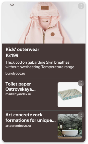
The design of the ad should fit different sizes of the container it's rendered in. Make sure to keep the minimum and maximum dimensions of the container in mind. If an ad unit with a native banner contains several ads, their layout should be the same. Here is what a misadjusted native ad looks like
|
|
Ad environment |
Make sure that the ad is displayed correctly in every environment you plan to use it in:
|
|
Accessibility features and settings |
The design should work correctly if the user has the following options enabled:
|
Contact support


You can also go to
horizontal scrollable ad feed